PAWSE
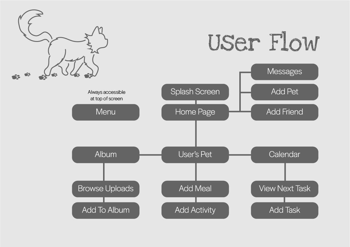
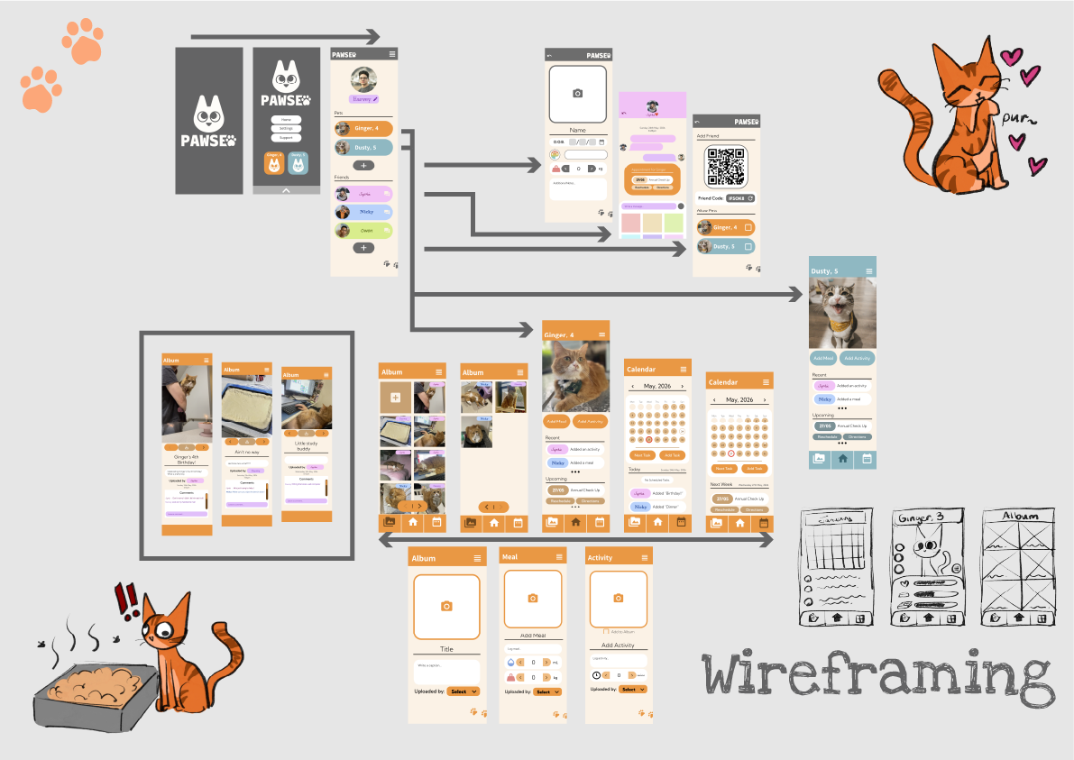
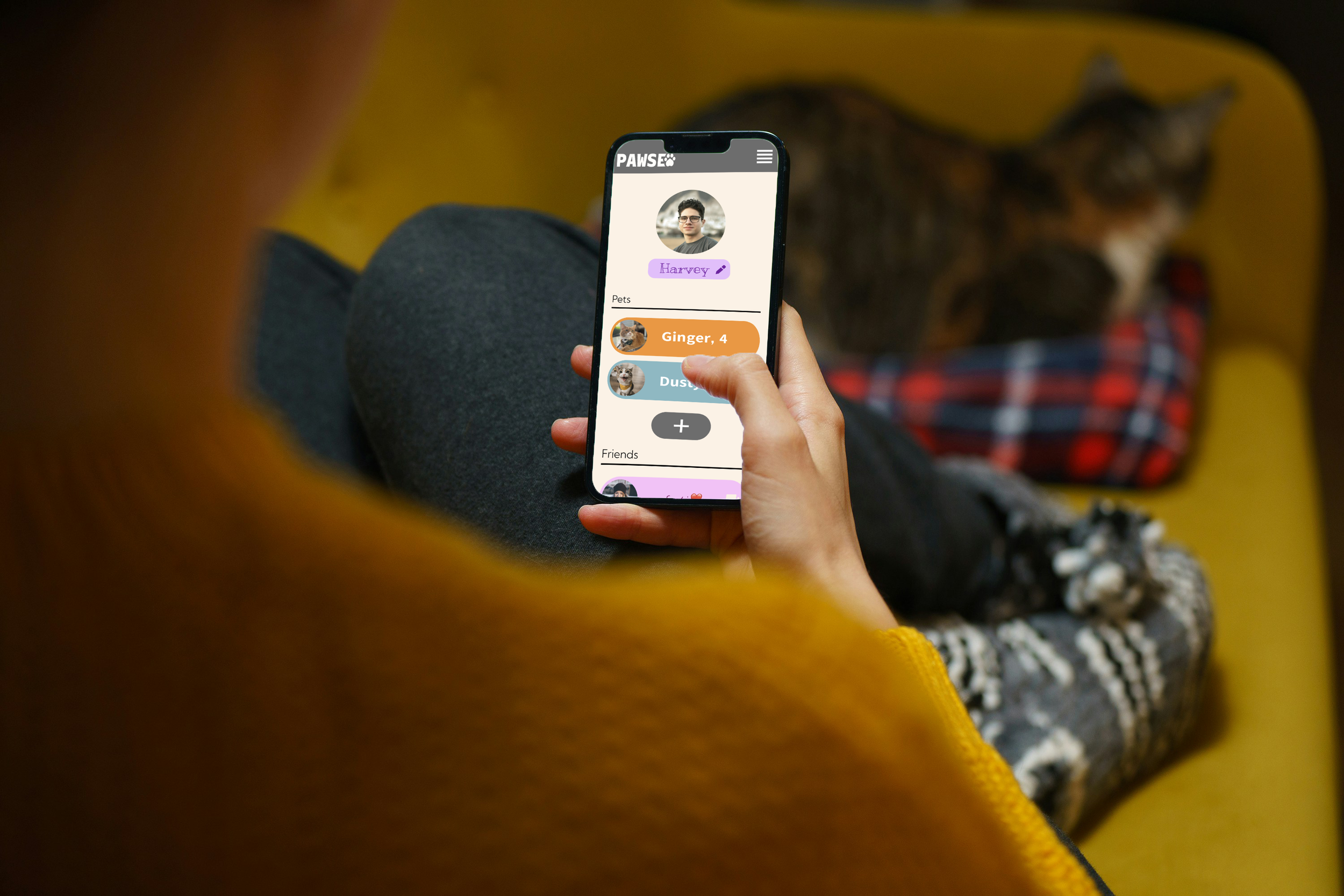
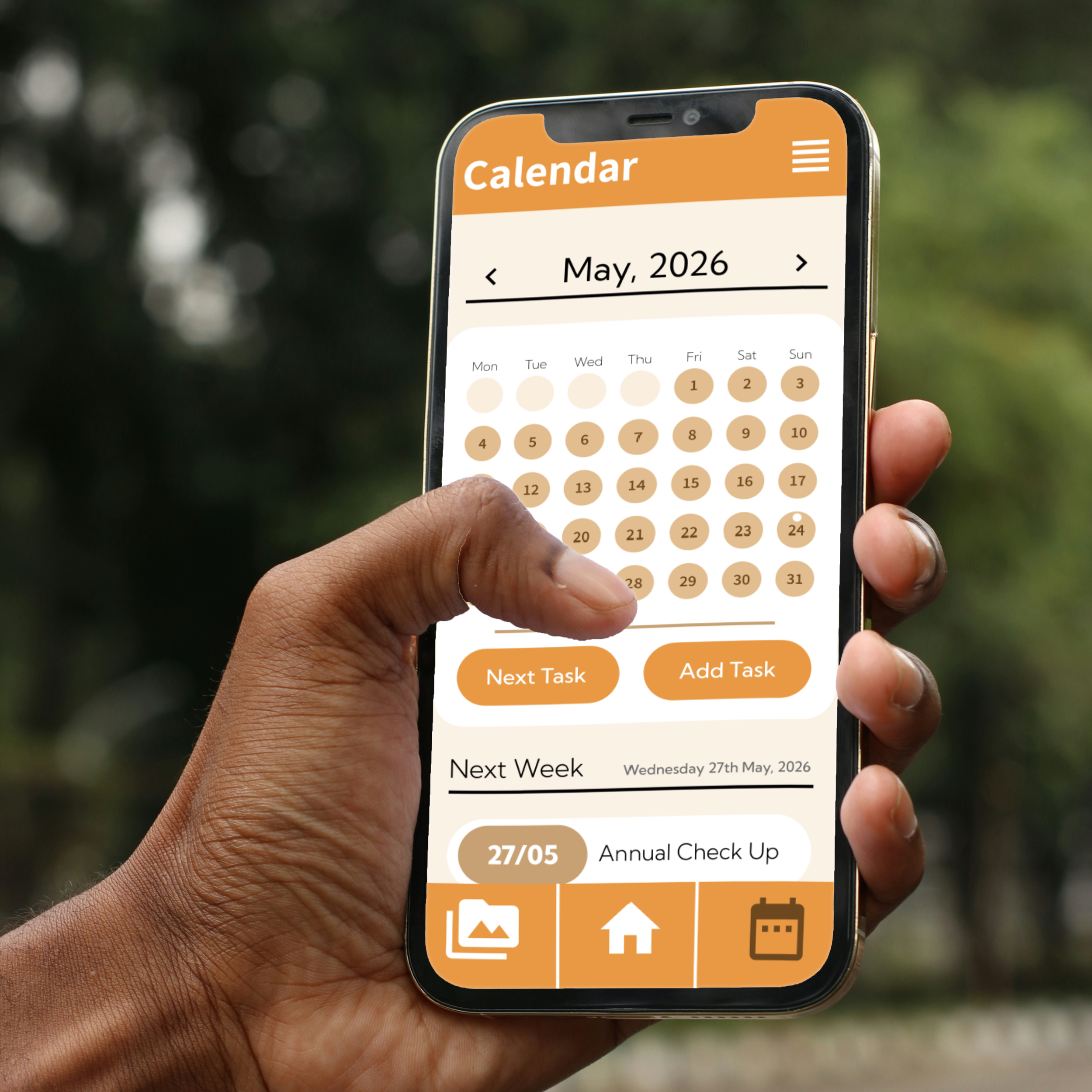
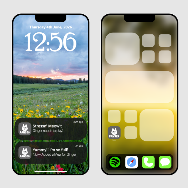
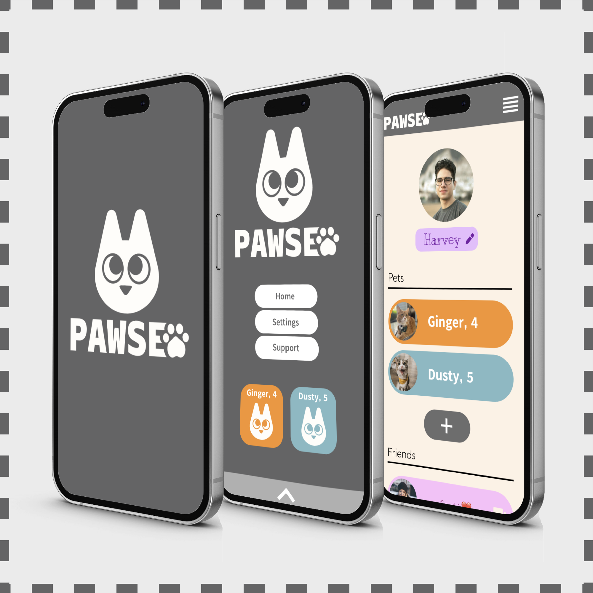
PAWSE is a mockup app that allows users to connect with the members of their households and communicate, in regards to their feline friends.

-
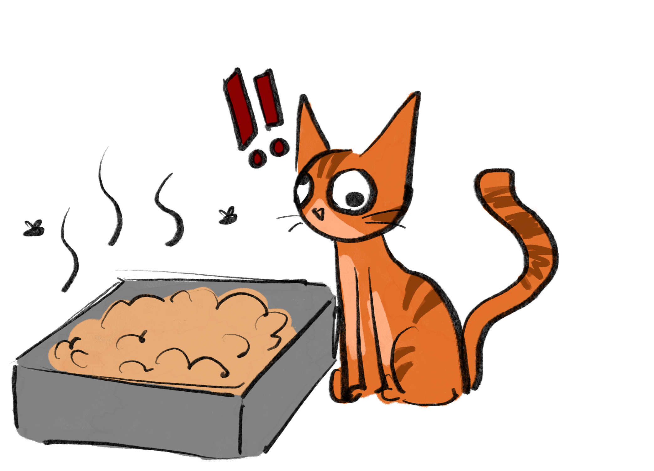
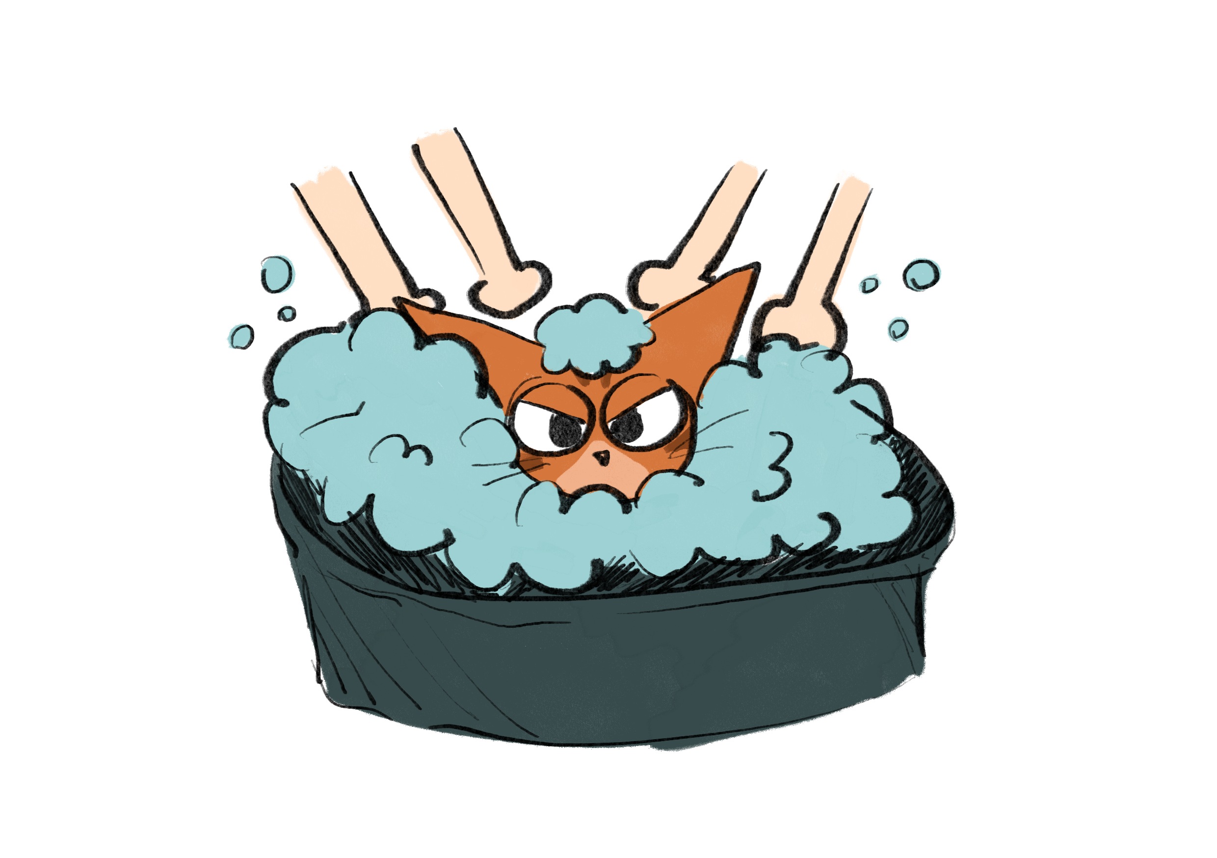
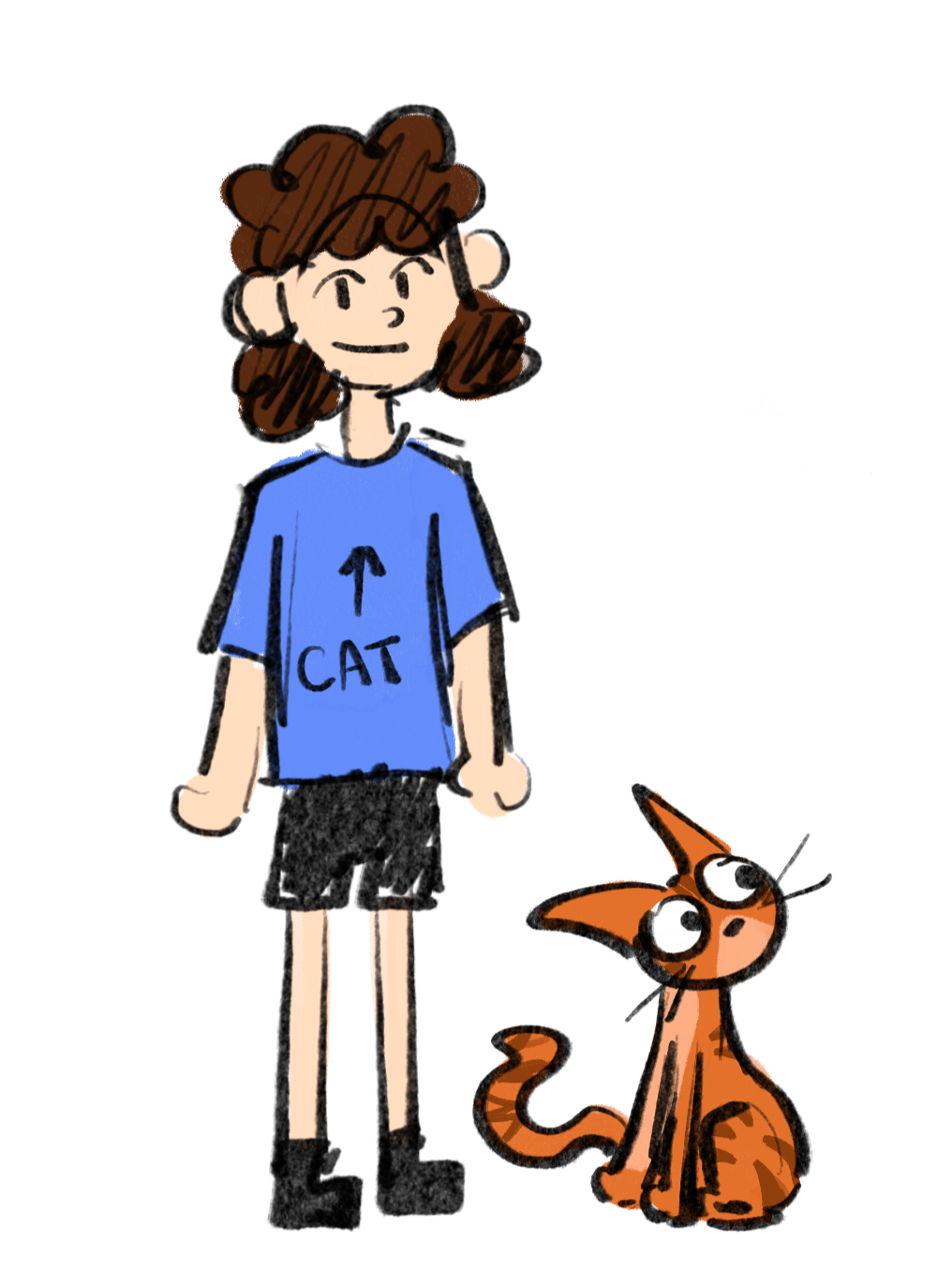
User X is a 21-year-old student, that has a cat and lives with three roommates. He often has trouble keeping up with his cat’s daily activities, leaving tasks unfinished, resulting in a frustrated kitty.
-
An app that allows users to connect with the members of their households and communicate in regards to their feline friends.
PAWSE is an all-inclusive app made to monitor and prioritise your cat’s health, with the help of friends and housemates.
-
This app was developed with one User in mind. Collaboration was achieved through various interviews and progress conversations.
Brand identity was drafted on Adobe Illustrator, the app was prototyped using Figma, and mock-up images using Adobe Photoshop.
Research
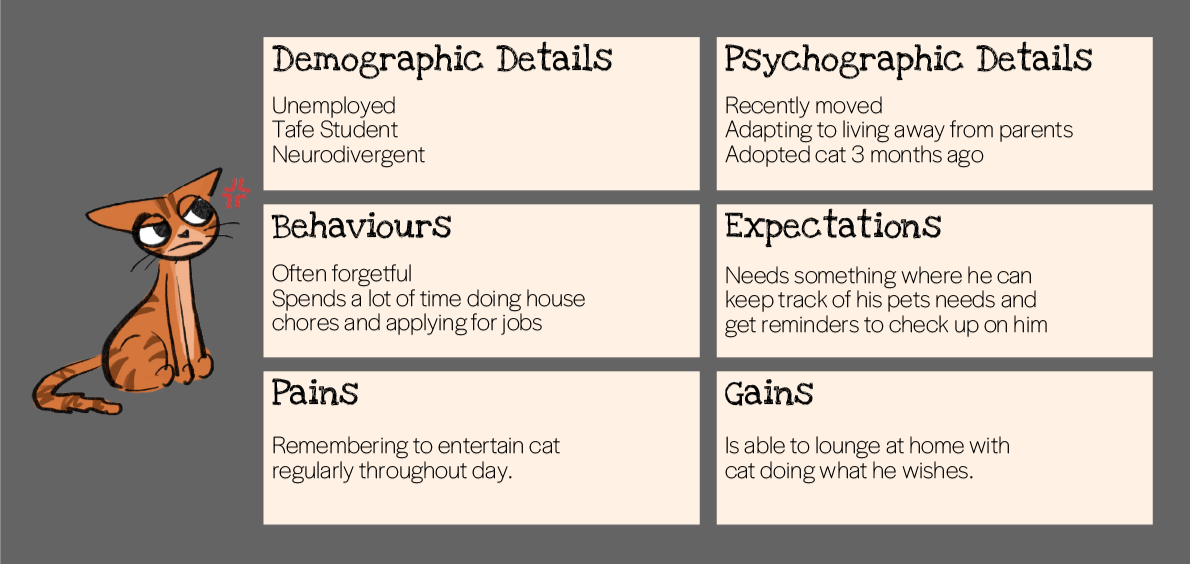
User X is a 21-year-old TAFE student, that is currently unemployed and spends most of his days at home, tending to the house and his cat.
User X was interviewed on a non-study day. His girlfriend was at work all day, so he was just spending time minding the house and taking care of their cat. Other housemates interact with the cat throughout the day, but ultimately the cat spends the bulk of these days with User X.
User X’s girlfriend is the main “resource provider”, meaning their cat will often wake her up in the morning to feed him and she’ll do it and then go back to sleep.
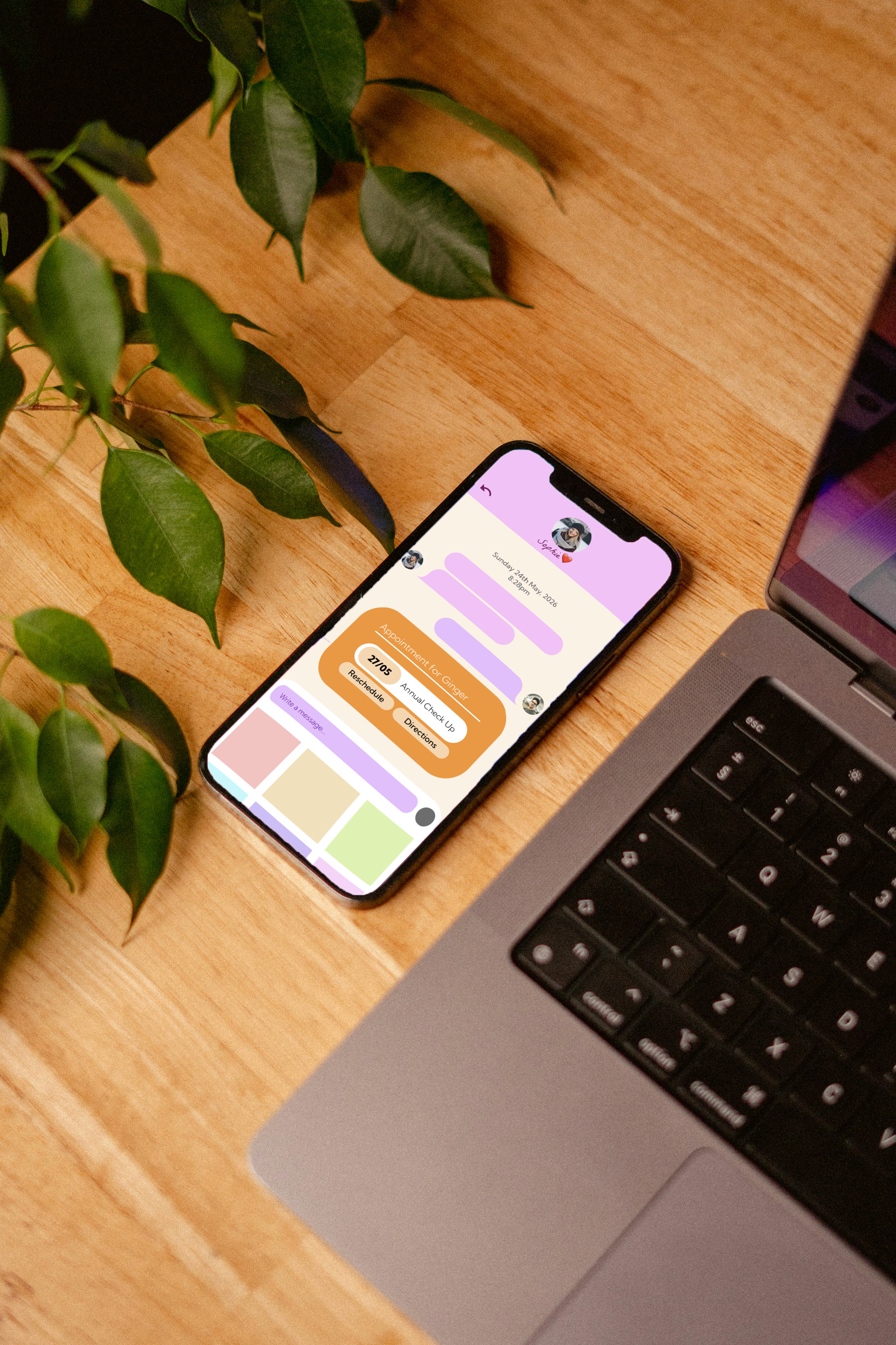
“It can be difficult to know when my girlfriend fed the cat if she is sleeping in, and I don’t want to disturb her.”
User X struggles with ADHD, this makes tasks like changing the litter and entertaining the cat every so often, even more difficult to remember.
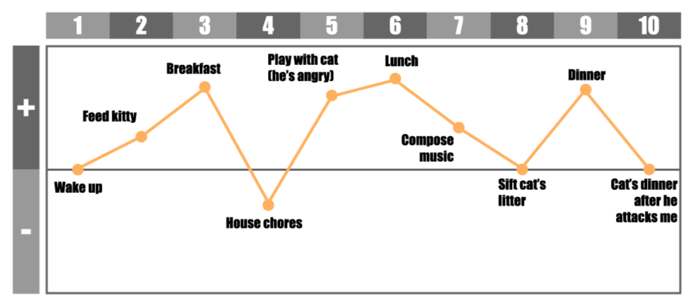
User X was asked to graph what an average day looks like when he is home with his cat.
This was the result.
Scenario Video
Brand
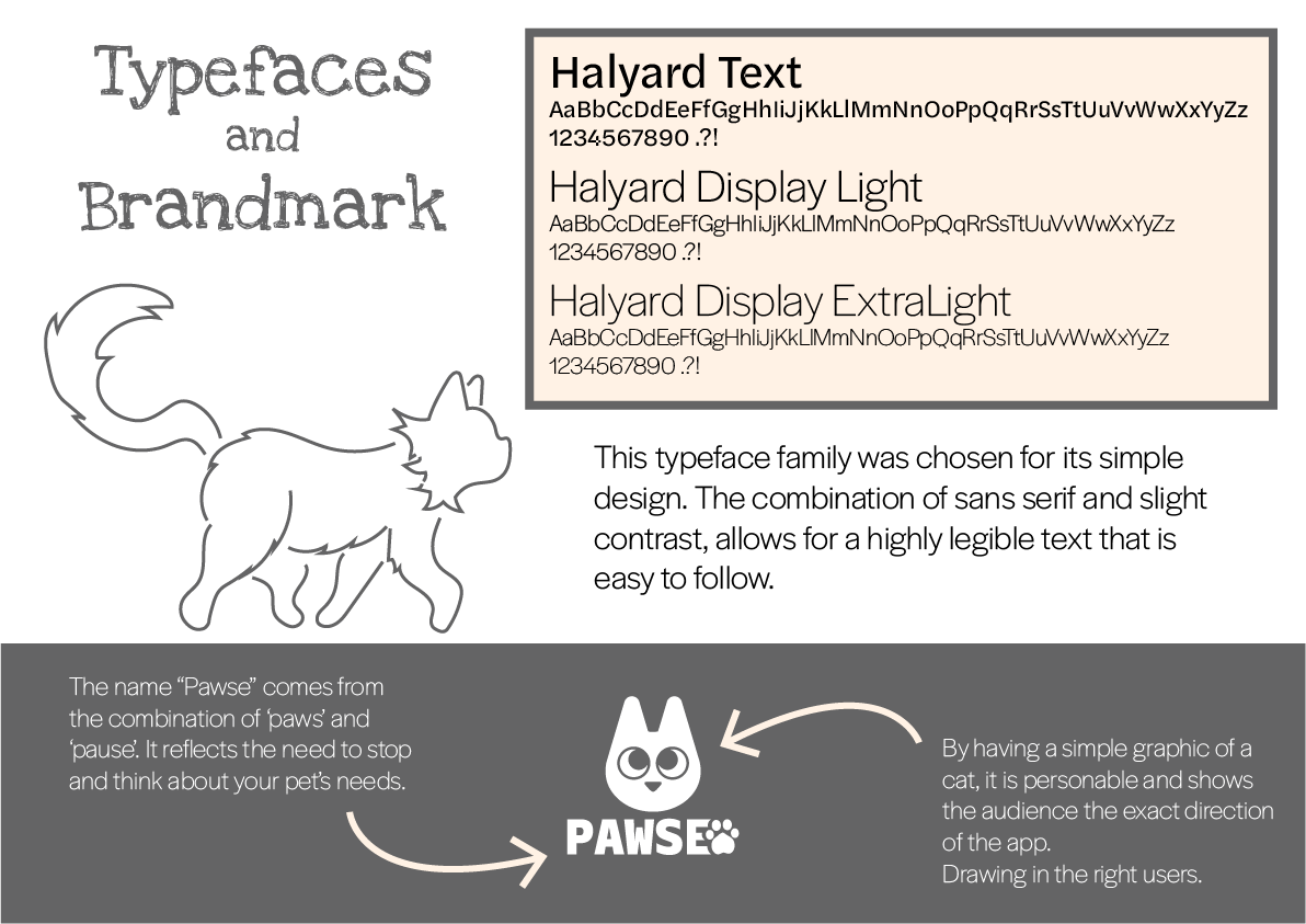
During the first stages of development, I was very set on using the colour orange as that is the colour of my user’s cat. I was trying to pair it with a blue colour as they contrast and I thought it would be appealing next to each other. The biggest piece of feedback that I received regarding my initial brandmark was that it was too sharp and the name was too clunky. So I softened the mark and fudged around until I found a name that was simpler.

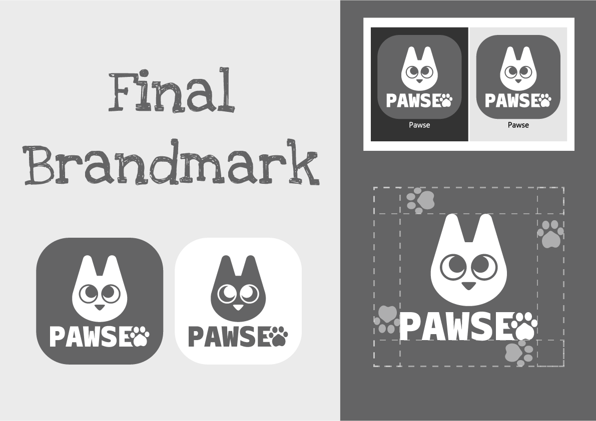
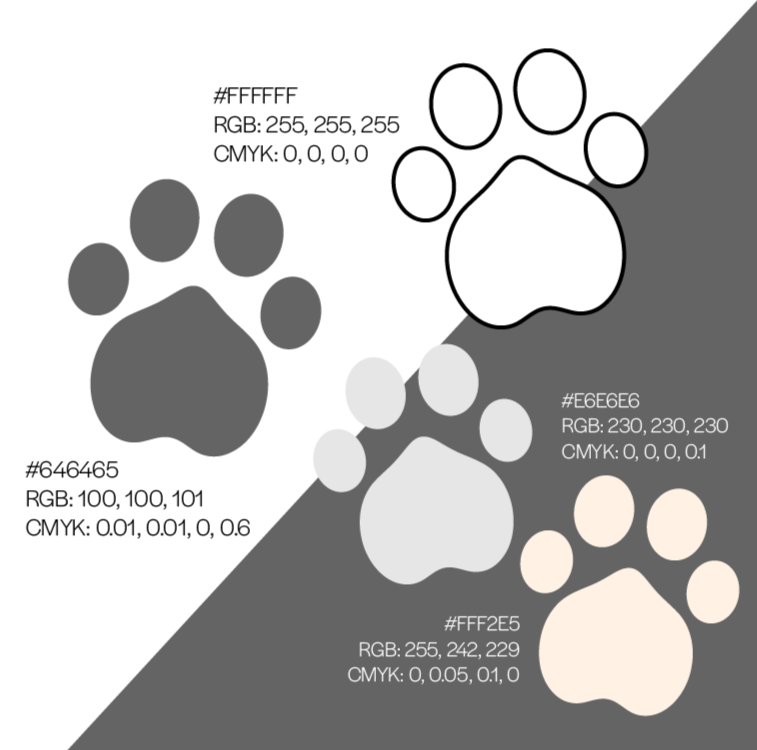
The main purpose behind this simple, greyscale colour palette was the need to make the app fully customisable.
Users are able to adjust the colours of their accounts and most importantly, their pets.
By having this simple main colour palette, it fits with most other colours and therefore does not make the app appear too cluttered and frustrating to use.
Colour Palette
Prototype